|
I haven't checked my mail in 2 years:
|
New logo blues The terrible news has finally struck home. My beer brand really has changed its logo. The beer brand I've been loyal too since I first had my first one is now something completely different. Sadly, the shock seemed to have been to much for Google which still stubbornly refuses to display the new logo when I tried to look for it.
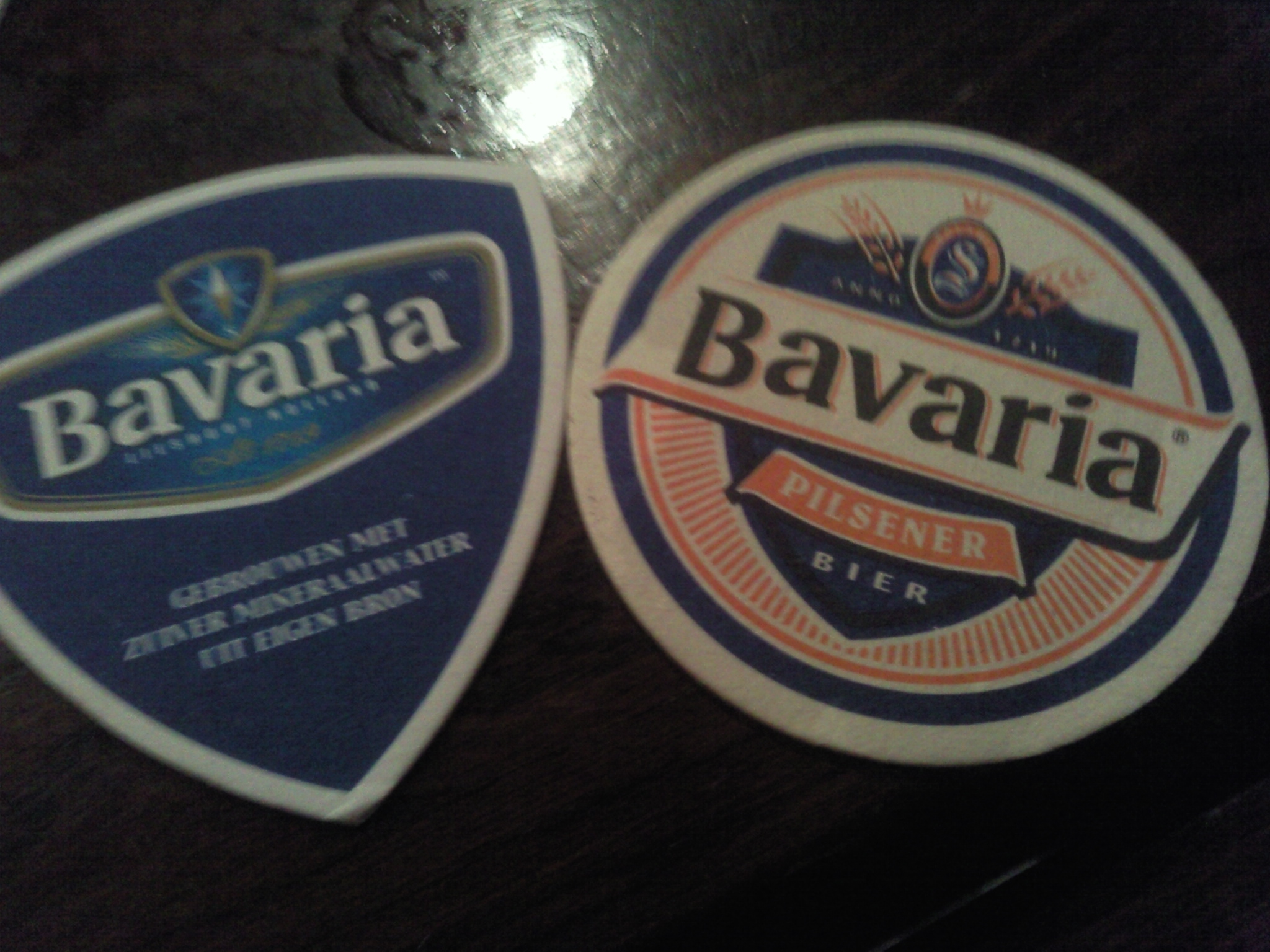
4-12-09 I understand your pain, Google. I'm hurt too. For weeks I refused to acknowledge it, saying that 'things change' and 'I rather like it' but I knew then I was lying, even to myself. First, change is never easy for me. I have eaten the exact same subway sandwich for 3 years now. The thought of ever buying a car that is not a Volkswagen terrifies me. Hell, I still use archaic Microsoft FrontPage because other website building software scares me. Second, I don't like the new logo. Here are beer coaster of the new one and the old.
I've been staring at these coasters for the better part of an hour trying to find something to like in the new one. Triangular is somehow better? Blue is good? Removing all things wheat related makes it modern? It doesn't work. I feel like I lost a part of me here. It hurts. It sucks. Not kindly excuse me, I need a beer. I still have half a crate of the old logo bottles and I'm gonna enjoy it as long as I can. The pain is still too fresh....
The new Bavaria logo sucks.
Back to the world of sucks and rules
|
|